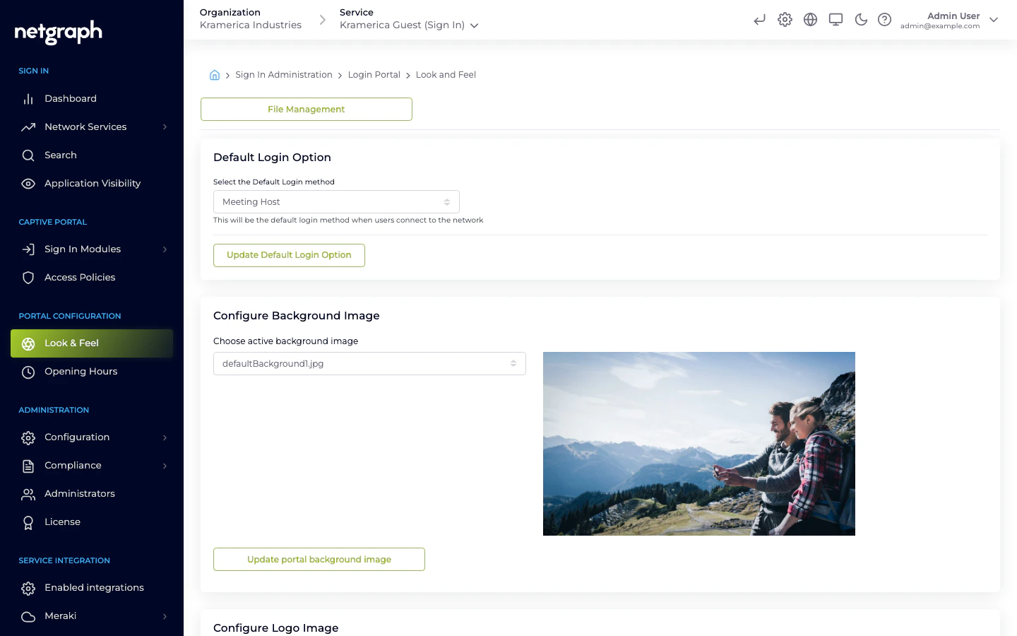
File Management
The logo, fonts and background image are picked from a library of files you’ve uploaded previously. Use File Management (button at the top of Look & Feel) to upload:- Logos — PNG, SVG, or JPG. Transparent backgrounds usually look best.
- Fonts —
.woff,.woff2, or.ttf. - Background images — JPG or PNG, full-page. The portal blurs the edges slightly; center-safe compositions work best.
Default Login Option
- Select the Default Login method — the sign-in method that opens first when guests hit the portal. Changing this doesn’t hide other methods; it only controls which tab is active by default.
Configure Background Image
- Choose active background image — pick one of the uploaded images. The preview thumbnail shows what will render behind the sign-in card.
Configure Logo Image
- Display Organization Logo — toggle whether a logo is shown above the sign-in form.
- Choose active Logo image — select the uploaded logo.
Configure Font
- Header Font — used for headings and the welcome text.
- Main Font — used for body text and form fields.
Configure Login Portal colors & buttons
Two groups sit inside this section: Panel configuration (the sign-in card itself) and Login button configuration. Both save together with the single Update Colors and Buttons button at the bottom.Panel configuration
| Setting | Applies to | Default |
|---|---|---|
| Choose Form Type | Sign-in card shape — Square or Rounded. | — |
| Text Color | Body text on the sign-in form. | #000e1e |
| Input Text Color | Text the guest types into form fields. | #555555 |
| Tabs Text Color | Labels on the login-method tabs. | #ffffff |
| Front Color | Tabs and links color. | #000e1e |
| Terms Color | Privacy Policy / Terms and Conditions link color. | #000e1e |
| Background Color | Tabs and panels background color. | #ffffff |
| Background Opacity (%) | 0 to 100 — how much the background image bleeds through the card. | 64 |
| Shadow Offset | Button and input form shadow offset. | 0 |
| Shadow Blur | Button and input form shadow blur. | 4 |
Login button configuration
| Setting | Applies to | Default |
|---|---|---|
| Choose Button Type | Button shape — Square or Rounded. | — |
| Button Color | Sign-in button background. | #000e1e |
| Button Text Color | Sign-in button text. | #000e1e |
Configure Portal Appearance
- Display simplified (no tabs) login portal if only one login option is selected — when a Context has just one active login method, this toggle hides the tab row and renders the single form full-width.
Per-language assets
Look & Feel settings apply across all languages. To change the text per language (welcome text, module labels, terms copy), see Languages.Preview the portal
Click the Captive Portal icon at the top of the admin header (hover to see the tooltip) to open the live portal in a new tab. Save Look & Feel changes first — the portal reads from the backend each time it loads.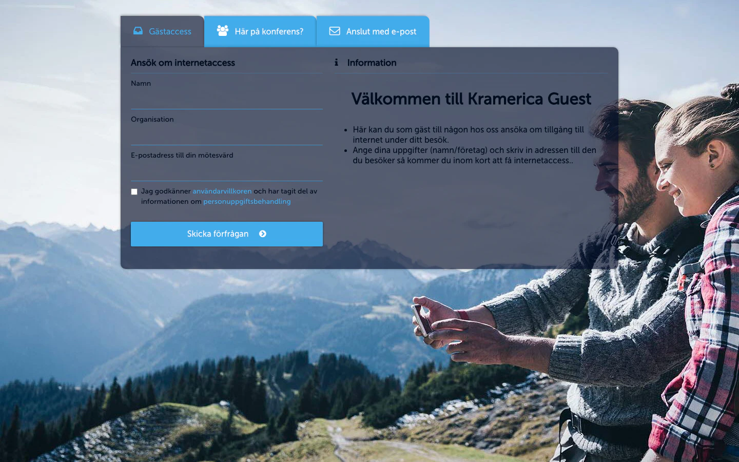
Next
Languages
Translate the portal and override specific strings per Organization.
Terms and conditions
Require guests to accept terms before granting access.